React: Drag and Drop from Scratch
Introduction
In this tutorial, we’ll build a drag-and-drop component from scratch in React, without relying on any third-party libraries.
The goal is not to replace mature drag-and-drop libraries, but to understand how drag-and-drop works at a fundamental level and how React state can be used to manage drag behavior cleanly and predictably.
Important notes
-
HTML5 provides a built-in
dataTransferAPI for drag-and-drop. While useful, this tutorial intentionally uses React state instead, which allows us to store richer data and keep application logic explicit. -
You can view and interact with the full working example on CodeSandbox:
View the CodeSandbox -
This is one of many possible implementations.
Drag and Drop in HTML5
HTML5 provides a set of attributes and events that make drag-and-drop possible. We won’t use all of them, but the following are essential:
draggable— makes an element draggable instead of selectableonDragStart— fires once when dragging beginsonDragEnter— fires when a draggable element enters a drop zoneonDragOver— fires continuously while dragging over a drop zoneonDrop— fires when the mouse button is released
The last four are passed into JavaScript handlers where we implement the drag-and-drop logic.
Getting started
We’ll create:
- a set of groups that items can be dragged between
- a set of items that can be moved from one group to another
Dnd.js
import React, { useState } from "react";
import "./Dnd.scss";

// A simple drag-and-drop demo component
export default function Dnd() {

  // Groups (columns) that items can be dragged between.
  // "noDrop" will become the special "forbidden" area later.
  const groups = ["group1", "group2", "group3", "noDrop"];

  // Initial list of draggable items.
  // Each item knows which group it belongs to via the `group` field.
  const initialItems = [
    { id: 1, group: "group1", value: "drag 1" },
    { id: 2, group: "group1", value: "drag 2" },
    { id: 3, group: "group1", value: "drag 3" }
  ];

  // Later we’ll store the live list of items in state:
  // const [items, setItems] = useState(initialItems);

  return (
    <>
      <div className="groups">
        {/* Render one "column" for each group name */}
        {groups.map((group) => (
          <div className="group" key={group}>
            {/* Group label */}
            <h1 className="title">{group}</h1>
            <div>
              {/* Only show items that belong to this group */}
              {items
                .filter((item) => item.group === group)
                // For each matching item, render a draggable box
                .map((item) => (
                  <div
                    key={item.id}
                    className="item"
                    // Native HTML5 drag-and-drop: this makes the div draggable
                    draggable
                  >
                    {/* Visible text inside the draggable box */}
                    {item.value}
                  </div>
                ))}
            </div>
          </div>
        ))}
      </div>
    </>
  );
}
Dnd.scss
// Container that holds all of the groups (columns)
.groups {
  display: flex;     // lay out groups horizontally
  margin: 5px;
  padding: 5px;
  flex-wrap: wrap;   // allow groups to wrap on smaller screens

  // Individual group/column styling
  .group {
    margin: 2px;
    padding: 20px;
    min-height: 16rem;     // ensure each group has some height even when empty
    background-color: green;

    // Group title inside each column
    .title {
      color: white;
      margin-top: 0;
    }
  }
}

// Style for each draggable item box
.item {
  background-color: yellow;
  color: blue;
  margin: 5px;
  padding: 5px;
  cursor: grab;      // communicates that the item can be dragged
}
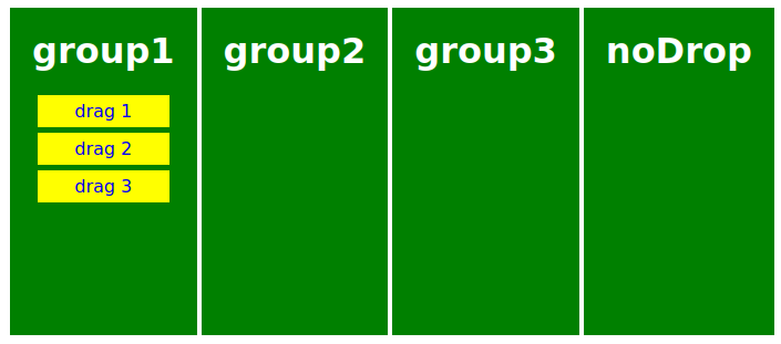
The code above produces a layout like this:
Adding drag-and-drop behavior
Now we’ll add event handlers and state to implement the actual drag-and-drop logic.
Most of the explanation lives directly in the code comments. Drag-and-drop logic is often easier to understand when read inline.
Dnd.js
import React, { useState } from "react";
import "./Dnd.scss";

export default function Dnd() {
  const groups = ["group1", "group2", "group3", "noDrop"];

  const initialItems = [
    { id: 1, group: "group1", value: "drag 1" },
    { id: 2, group: "group1", value: "drag 2" },
    { id: 3, group: "group1", value: "drag 3" }
  ];

  // Which item is in which group (source of truth for layout)
  const [items, setItems] = useState(initialItems);
  // { id, initialGroup } — which item we're dragging and from where
  const [dragData, setDragData] = useState({});
  // Non-empty when pointer is over the noDrop zone (for visual feedback)
  const [noDrop, setNoDrop] = useState("");

  const handleDragStart = (e, id, group) => {
    setDragData({ id, initialGroup: group });
  };

  const handleDragEnter = (e, group) => {
    if (group === "noDrop") {
      setNoDrop("noDrop");
    }
  };

  // Required: without preventDefault, drop never fires on this element
  const handleDragOver = (e) => {
    e.preventDefault();
  };

  const handleDragLeave = () => {
    setNoDrop("");
  };

  // Move item to a new group by copying state and updating the item's group
  const changeCategory = (itemId, group) => {
    const newItems = [...items];
    newItems[itemId - 1].group = group;
    setItems(newItems);
  };

  const handleDrop = (e, group) => {
    setNoDrop("");
    const selected = dragData.id;

    if (group !== "noDrop") {
      changeCategory(selected, group);
    }
  };

  return (
    <div className="groups">
      {groups.map((group) => (
        <div
          key={group}
          className={
            group === "noDrop" && noDrop === "noDrop" ? "noDrop" : "group"
          }
          onDragEnter={(e) => handleDragEnter(e, group)}
          onDragOver={handleDragOver}
          onDragLeave={handleDragLeave}
          onDrop={(e) => handleDrop(e, group)}
        >
          <h1 className="title">{group}</h1>

          {items
            .filter((item) => item.group === group)
            .map((item) => (
              <div
                key={item.id}
                className={
                  // Show not-allowed cursor when dragging over the noDrop zone
                  group === "noDrop" && noDrop === "noDrop"
                    ? "notAllowed"
                    : "item"
                }
                draggable
                onDragStart={(e) =>
                  handleDragStart(e, item.id, group)
                }
              >
                {item.value}
              </div>
            ))}
        </div>
      ))}
    </div>
  );
}
Dnd.scss
.groups {
  display: flex;
  margin: 5px;
  padding: 5px;
  flex-wrap: wrap;

  .group {
    margin: 2px;
    padding: 20px;
    min-height: 16rem;
    background-color: green;

    .title {
      color: white;
      margin-top: 0;
    }
  }

  .noDrop {
    margin: 2px;
    padding: 20px;
    min-height: 16rem;
    background-color: red;
    cursor: not-allowed;

    .title {
      color: white;
      margin-top: 0;
    }
  }
}

.item {
  background-color: yellow;
  color: blue;
  margin: 5px;
  padding: 5px;
  cursor: grab;
}

.notAllowed {
  background-color: yellow;
  color: blue;
  margin: 5px;
  padding: 5px;
  cursor: not-allowed;
}
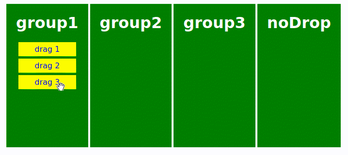
Result
Here’s what the finished drag-and-drop interaction looks like:
Conclusion
This approach demonstrates the core mechanics of drag-and-drop using:
- native HTML5 drag events
- React state for tracking drag context
- minimal logic and no external dependencies
For complex use cases (nested lists, touch support, accessibility), a dedicated library may be the better choice. But for simple, controlled interactions, this approach is often more than enough.
You can explore and experiment with the full example here: 👉 View the CodeSandbox